“Living Pictures”: Visualizing Data with Tableau
For me, the word "tableau" used to provoke the French definition: a painting or canvas. Aficionados of art history may even associate the word with a style known as "tableau vivant", or "living picture". As you may have guessed, the word now holds new meaning for me- although in many ways the definition still rings true.
About one year ago, our team at Catalyst Kitchens began using Tableau software to better analyze and visualize the columns and rows of data collected from our membership network. If you’re not familiar with Tableau, their products are designed to help people better see and understand their data in order to "discover opportunities, answer questions you didn't know you had, and share data stories". It's like Microsoft Excel's stylish bilingual cousin.
[youtube https://www.youtube.com/watch?v=Qo6W-oBO9XM&w=560&h=315]
It's no secret that the nonprofit sector has historically underutilized the power of data. A 2016 study from the Nonprofit Hub found that 60% of non-profit organizations surveyed were not using data consistently to make decisions. However, the study found that 97% reported an interest in learning how to use data more efficiently.
We've been collecting outcomes data around our food service job training programs at Catalyst Kitchens for years. This enabled us to report annually on our collective impact- such as the cumulative number of people trained through our programs or the number of meals served to individuals in need. We are now able to bring this to the next level through our work with Tableau, and more specifically through the generous support of the Tableau Foundation.
The Nonprofit Hub found that 60% of non-profit organizations surveyed were not using data consistently to make decisions.
Next week we'll share outcomes bench-marking reports with all of our member organizations. For the first time, the non-profits in our network will have a basis of quantitative comparison against other training programs and a better understanding of which programs are most similar to them. Members will have the ability to filter data sets for metrics such as number of trainees graduated and target population served to ensure that the data insights are as relevant as possible.
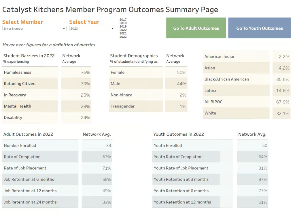
Snapshot of a Catalyst Kitchens bench marking report.
These reports will serve to provide industry standards that help define success and target opportunities for improvement. We see this kind of analysis as a shining example of why the Catalyst Kitchens network exists and simultaneously feel we've just scratched the surface of what lies ahead. Thank you, Tableau Foundation, for supporting data science in the social impact space!
Citations:
- Download a free trial of Tableau software
- Read the Nonprofit Hub study: The State of Data in the Nonprofit Sector
- Discover more about the Tableau Foundation
